Phido Group Brand & Website

about the project
scope: Branding, SEO, COPY & Website design
brand words: Clean, Sophisticated, Modern, Simplistic
Phido Group is a home builder based in Oklahoma City with a strong reputation and a clear vision—they just needed a brand and website to match. When they reached out, they were ready for a full overhaul of their existing visual identity. The only creative requirement? Incorporate the Phi (Φ) symbol, which has long been part of their brand and represents the golden ratio—an iconic symbol of balance, proportion, and intentional design. Perfectly aligned with the values of thoughtful home building.
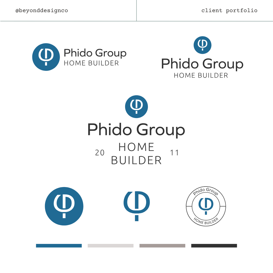
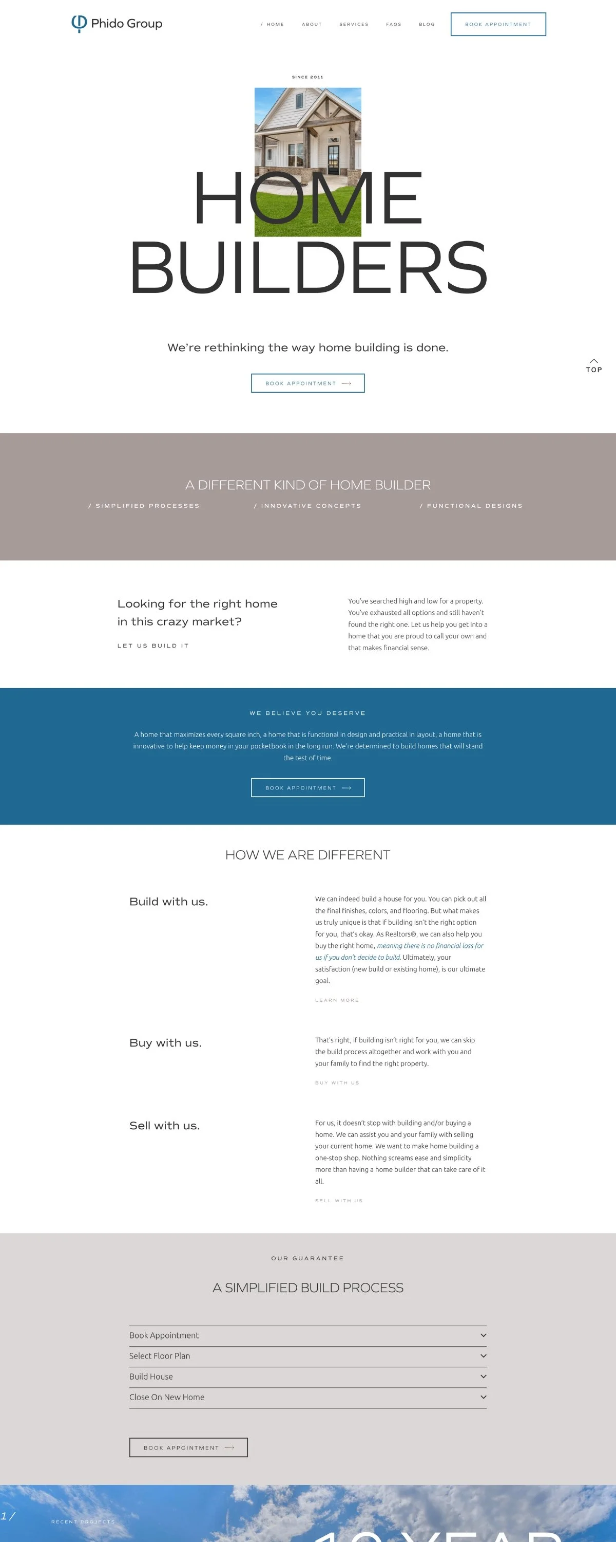
We developed a custom monogram that cleverly weaves the letter P and the Phi symbol, with subtle nods to a G as well—creating a mark that encapsulates their name, ethos, and aesthetic. The final result is versatile, symbolic, and timeless. For the website, the directive was clear: keep it minimal and let the work speak for itself. We designed a sleek, image-forward experience that prioritizes clean lines, intuitive navigation, and a strong architectural feel—mirroring the quality and intention behind every Phido Group build.


